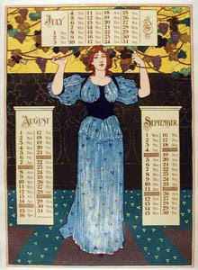
i find it so interesting that two of the three major artists
in the turn-of-the-century realm of graphics
in america both did the same thing at the same time.
in the turn-of-the-century realm of graphics
in america both did the same thing at the same time.

they had to know each other. louis rhead and edward penfield,
joined with will bradley, were bright lights then,
and have, astonishingly, stayed bright.


Great art nouveau graphics! It is interesting that two major illustrators picked the same theme....I say it was competition! Lovely post.
ReplyDeletethanks so much, theresa. okay, so if it was competition, how did that happen? i mean, to producea calendar like this, one must begin months earlier.
ReplyDeletemaybe, if publishing was anything then how it is now the publishers had to announce their "winter list" months before.....
beautiful...interseting...their seemed to be a few poses that owed a little to "Flaming June" (the artist's name escapes me). I think there might have been a few "universal poses" at the time...& that the poses were particularly universal at THAT time..if that makes any sense...(Fredrick Leighton- ty Google)
ReplyDeleteyes! now that you point it out i can definately see the pre-raphaelite/classic-revival stuff in them. but look how we now see the japanese influence so strongly.
ReplyDeletei love the image for oct-dec...what beautiful colors! and the blues of summer...
ReplyDeletelovely post!
hi zoe. yeah i found that one somewhere that only had that one, and it was the best reproduction of all of them.
ReplyDeletethe one whose colors i find most surprising and delightful is the jan-mar one.