revolution by simplicity
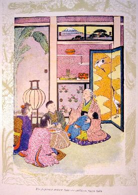
 Many developments in 19th century art reflect the influence of Japan. Artists such as Manet experimented with flattened forms after seeing Japanese prints. Vincent van Gogh collected hundreds of Japanese prints, and they influenced his use of brilliant colors and heavy outlines. Larger artistic movements such as Arts and Crafts and Art Nouveau have a great deal of Japonisme at their root. Though the primary Japonisme craze was in the 1880's and 90's, artists and designers continued to use elements of the style for some time, particularly when dealing with Japanese themes.
 With respect to book-binding, cover designers employed a variety of techniques that reflected an interest in Japanese style. In the Victorian period, covers that didn't necessarily look Japanese showed the influence through the use of asymmetrical design, strong diagonals, oriental typefaces and motives, and a variety of fill patterns.
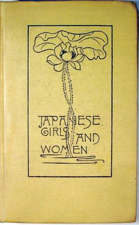
 In the move away from more gaudy Victorian covers, many designers appreciated the simplicity of some of Japanese style. Some covers mimicked the binding style of Japanese books, or Japanese paper. Others used an oriental style typeface or actual Japanese characters. Asymmetrical design continued to be popular as well as imitations of the flat Japanese landscape style. Many of the covers of books by author Lafcadio Hearn are done in these styles, reflecting his subject matter and immigration to Japan.
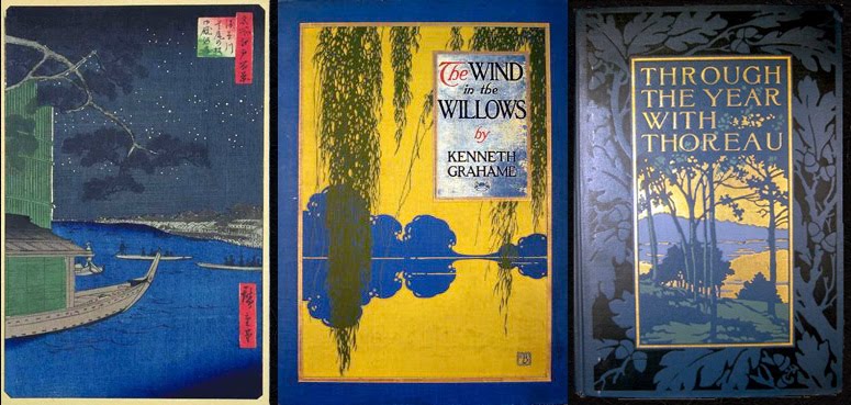 Certain known cover designers showed influence by Japonisme. Some of Sarah Wyman Whitman's simple elegant designs have evidence of roots in Japonisme, while others use more explicit Japanese motifs, although she herself denounced the gaudy 1880s eclectic covers that "represented a combination of bad French art mixed with Japanese art; scrolls and arabesques, which had to do with some debased form of book cover mixed with a bit of Japanese fan." Several covers by Bertha Stuart, who designed primarily between 1903 and 1911 show a strong Japanese influence as well.
 not, i will admit, wholly new, but i believe all of these extraordinary images are, new to this blog. much much more at the website where these words come from, HERE. these designers, they take my breath away. see more from this blog (including links) HERE.
Labels: bookbinding, bruce rogers, harunobu suzuki, hiroshige ando, paper, paul bransom, sakai hoitsu, sarah wyman whitman, sipkema, zeshin sabata
posted by lotusgreen at 1:58 PM
12 comments
![]()
![]()