japonisme

06 July 2011

revolution by simplicity

Many developments in 19th century art reflect the influence of Japan. Artists such as Manet experimented with flattened forms after seeing Japanese prints. Vincent van Gogh collected hundreds of Japanese prints, and they influenced his use of brilliant colors and heavy outlines. Larger artistic movements such as Arts and Crafts and Art Nouveau have a great deal of Japonisme at their root. Though the primary Japonisme craze was in the 1880's and 90's, artists and designers continued to use elements of the style for some time, particularly when dealing with Japanese themes.

With respect to book-binding, cover designers employed a variety of techniques that reflected an interest in Japanese style. In the Victorian period, covers that didn't necessarily look Japanese showed the influence through the use of asymmetrical design, strong diagonals, oriental typefaces and motives, and a variety of fill patterns.

In the move away from more gaudy Victorian covers, many designers appreciated the simplicity of some of Japanese style. Some covers mimicked the binding style of Japanese books, or Japanese paper. Others used an oriental style typeface or actual Japanese characters. Asymmetrical design continued to be popular as well as imitations of the flat Japanese landscape style. Many of the covers of books by author Lafcadio Hearn are done in these styles, reflecting his subject matter and immigration to Japan.
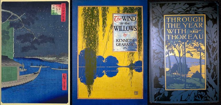
Certain known cover designers showed influence by Japonisme. Some of Sarah Wyman Whitman's simple elegant designs have evidence of roots in Japonisme, while others use more explicit Japanese motifs, although she herself denounced the gaudy 1880s eclectic covers that "represented a combination of bad French art mixed with Japanese art; scrolls and arabesques, which had to do with some debased form of book cover mixed with a bit of Japanese fan." Several covers by Bertha Stuart, who designed primarily between 1903 and 1911 show a strong Japanese influence as well.

not, i will admit, wholly new, but i believe all of these extraordinary images are, new to this blog. much much more at the website where these words come from, HERE. these designers, they take my breath away. see more from this blog (including links) HERE.

Labels: , , , , , , , , ,

04 July 2011

no wedgies either

No ironic commentary on their clothing, their religion, their customs, shall be done, and no rude or insulting words shall be sent them.


We will not use the words keto (Chinese hairy) akahige (red beard), and ijin (barbaric).


One should not face them with impert- inence.


When we visit a strange house, one should be wearing clean shoes.


Foreign missionaries must be respected as equal to Japanese priests.


Avoid disturbing the games or rides strangers by throwing tiles, stones or sticks, or spitting, throwing fruit peels and scraps of cigars on trains or boats where you find them.


oddly, these words appear just under that lovely photo of the horikiri iris garden. if there is a larger context, neither my french skills nor my translating (google) patience give me any real context. it may surprise you (it surprised me) to learn that the photograph was taken in 1915, and hiroshi yoshida's print of the same place is from 1928. and the book is HERE.

Labels: ,

16 January 2009

the strange mr. strange


edward fairbrother strange made his living writing articles and books about design: lettering, bookbinding, lace, etc. his tone was often one of arch dissatisfaction and resentment that no longer were the excellent standards of the past being upheld.

we've met him already, listening to him rail against the degenerate work of seitei watanabe, and i promised you you'd hear more. after railing generally against american book design, he says:


to turn to the consideration of some particular cases, one is compelled to reiterate a somewhat well-worn story, that of the wide-spread and curious influence of aubrey beardsley. the cover designs by bertram g goodhue are often full of it--
beardsley's earlier manner of the morte d'arthur;

but of all beardsley's disciples the one who has more closely approached to him in method is will h bradley. the binding of the romance of zion castle is a typical example of this somewhat common tendency. here we have another version of the 'avenue poster' type of decoration;

with, however, not a tithe of the marvellous success of the latter in indication form and drapery by judiciously balance flat masses. in mr bradley's design the gold is over-done, and the hard boundary lines to which it gives rise spoil the effect of the decidedly clever distribution of the upper part of the cover.

the same artist's lyrics of earth wants balance; the serpentine line is rather too heavy, and not very gracefully distributed, although the tree is well rendered and just in its proper place.

a very pleasant treatment of a conventional landscape is that adopted by mr louis rhead, in meadow grass. the use of a picture pure and simple for a cover, instead of some arrangement of ornament, is a new and dangerous device; and it requires powers of no uncommon order to secure for it the success obtained by mr rhead in this instance.

a book-cover has been made by margaret armstrong for love-letters of a musician. it is good in color, the rare subordination of the two lines of floral diaper giving a pleasing effect, but the head of st cecelia, done on an inlay of vellum in slight relief, and the border gold which surrounds it, seem rather forced and over-wrought.

the same artist has produced an effective composition of poppies and pipe-stems, in crimson, light green and gold, on coarse white canvas, for washington irving's rip van winkle.

this is, one would imagine, a good 'saleable' cover, though, from the critical point of view it must not be too closely considered, and the lettering cries aloud for condemnation.

(mr strange was by no means alone in his pouts; snipping, snapping and sniping were the trade of the day in the large and gor- geously produced periodicals covering the art world. so what else is new?)

Labels: , , , , , , , , , ,

11 May 2007

my yiddisha nightingale


1. Miss Minnie Rosenstein

Had such a voice so fine
Just like Tetrazzini
Any time that Minnie sang a song
You'd think of real estate seven blocks long
Some song!

Young Mister Abie Cohn used to call to her home
Just to hear her singing
Presents he was bringing
Full of bliss!
One night young Abie proposed to the Miss
Like this!

Yiddisha nightingale, sing me a song
Your voice has got such sweetness that it makes me strong
Yiddisha nightingale, sing me a song
I promise that I'll take you on a long honeymoon
I'd give a dollar to hear you, my queen

I wouldn't give a nickel to hear Tetrazzini
Just to hear your cultivated voice good and strong
I'd serve a year in jail
Yiddisha nightingale
Won't you sing me a song?

2. Then said young Abie Cohn
"I'm going to buy a home
One that's made of marble
Dear, where you can warble harmony
And I don't care for expenses you see
That's me!

I'll go and learn to play on the piano, say
You'll sing while I'm playing
People will be saying
As they pass
Some class!"

[song by irving berlin; toshikata mizuno; japanese fabric via florizel; charles louis verwee, a belgian, painted 'vanity.' the vase is by ando jubei, from the meiji era in japan; some considered it the golden age for cloisonne created for export, with the encouragement of the government.1 book design by carlos schwabe; george lepape did the artwork, but i don't know the designer....; lastly is flower viewing from shuntei miyagawa.]

the tune is here.

Labels: , , , , , , , ,

19 April 2007

singing the unsung


just a few of the books at pbo unattributed to any designer

Labels: ,

18 April 2007

at long last armstrong

so much is evoked by the book designs of margaret armstrong that it is inconceivable that there would ever be any style of design that would be unnatural to her hands.

here in this small selection, the pure, simple japonisme is obvious, including the imagery of poppies, dragonflies, and lotus.

but also obvious are the design forays into arts & crafts, an off-shoot of japonisme with its own particular character. the van dyke books take on this flavor.

in any case, the exuberance, the thrill with 'the line' and with ornament, the pleasure with the natural world, all make this woman--this designer's offerings still a gift today.

resources
binding collection

american book designer
publishers' bindings online
unseen hands
flower bindings
beauty for commerce
handsome books (plus do a search for her name)

Labels: , ,

16 April 2007

Sarah Wyman Whitman

Sarah Wyman Whitman was a true pioneer of American book design. Not because of her gender (though she certainly was a path-breaker for working woman artists) but for her seminal graphic sensibility, which transcended the commonplaces of Victorian-era book design. Whitman was born in Lowell, Massachusetts in 1842. She might have settled into bourgeois life after marrying the prosperous wool merchant Henry Whitman in 1866, but instead, she embarked on a serious artistic career. She studied painting and drawing in France, but she was most profoundly influenced by the burgeoning Arts and Crafts movement in England, championed by William Morris and others. (more)


more about whitman, and more of her book designs here.

and, again, here.


It has been said that she began “the golden age of American artist-designed bindings” of the 1880s, and that her particular style of lettering and stylized decorative vignettes anticipated what developed into the Art Nouveau style of the next decade.
(more)


and here --

and yet more here


this all because of harlequinpan who identified this artist for this book. and i have to admit. it's my favorite.

and i must also admit i have more book designers coming along soon....


oh, did i mention whitman was also a painter? in the mfa collection, of course.

Labels: , ,

bertha stuart

there is little i could find on the book designer bertha stuart herself, though there seems to be an ongoing, even increasing interest in book design--and special focus on women in the field, and on japonisme.

one source of great knowledge on many of these beautifully designed books can be found here. each of his offerings, and we will visit him again, is carefully described, inside and out, and put into context.

additional selections maybe found here, and again... we'll be back.

and, wonderfully, here, where can be found this: New Century: the 1900s “Poster–style” designs flourish, with simple but eye-catching designs with a two–dimensional feel, and with the cloth color an important space–filling component of the whole; designers aren’t shy about using in–your–face typefaces in large sizes. Cloth grained to resemble natural fabrics is popular. Black–and–white and color relief halftone onlays appear on front covers, often using designs or images similar to those on the books’ dust-jackets. Imaginative designs appear throughout the market, from top–of–the–line luxury productions to cheap series bindings; the overall quality of American cloth bookbinding designs reaches its acme.

[i think someone needs to read this blog.]

lastly, on the wonderful japanese page i introduced yesterday, i found this amazing bertha stuart example. perhaps the best of all.

Labels: , ,

older posts