
is everybody HAPPY?
 fear, again. it's as taboo as, say, sadness or homosexual love. all as natural as can be -- just let nobody see. there's only one emotion that's permissible to show (unless it's the first week after a funeral): HAPPY!
 what do they say when they point a camera at you? SMILE! (or its artificial alternative, 'say cheese.' even an artificial happy is better than a real something else.)
 we are forced into a theater of our own making. create a scrim to shield reality (it from you, you from it), and a backdrop so the farce maintains a context. "i'm cool."
 if you show your fear it might belie a marginal confidence. learn from the politicians and the oil executives: sound strong (and caring) and there'll be few who'll guess that you are neither.
 Gray skies are gonna clear up,
 Put on a happy face;
Brush off the clouds and cheer up,
Put on a happy face.
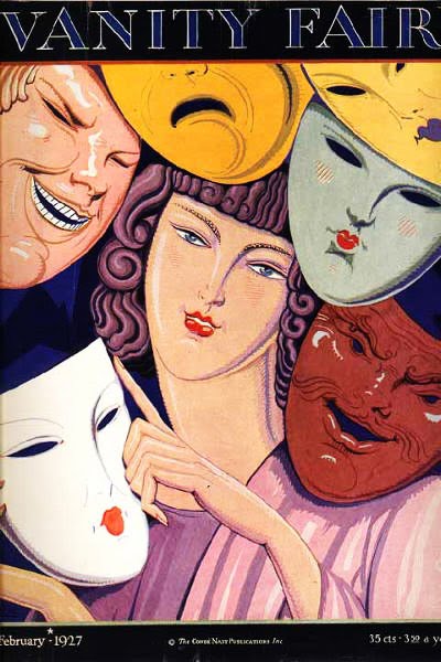
Take off the gloomy mask of tragedy,
It's not your style;
You'll look so good that you'll be glad
Ya' decide to smile!
Pick out a pleasant outlook,
Stick out that noble chin;
Wipe off that "full of doubt" look,
Slap on a happy grin!
And spread sunshine all over the place,
Just put on a happy face!
 Now if there's a smile on my face
It's only there trying to fool the public
But when it comes down to fooling you
Now honey that's quite a different subject
But don't let my glad expression
Give you the wrong impression
'Cause really I'm sad, Oh I'm sadder than sad
Well I'm hurt and I want you so bad
Like a clown I appear to be glad ooh yeah
 but isn't it there for all of us? is it not our whole emotional cornucopia that makes us such thrilling creatures? yes. like i said yesterday, fear all the time -- why? where does it come from? it's survival instinct. it's your mother telling you to look both ways. it's every ad in the book telling you you're doing it wrong.
 'no, i ain't scared, now pass the bottle.' and we might spend entire lifetimes certain that 'nah, i ain't scared' because what do you think that scrim is made of?
 so many ways to not show fear (even to yourself): alcohol, drugs (legal and otherwise), smoking, developing a rigid world view (including a religious one); some tell jokes, some have somebody new in their bed every night. some shoplift, some go into therapy. but most won't tell you. most might not even tell themselves.
 What if i say something wrong? what if i have a piece of spinach caught in my teeth? what if i'm dressed wrong? what if i look like an idiot? what if, and of course this is the big one, what if i'm doing it all wrong. what if i've been down so long it looks like up to me? what if everything i know is wrong? is anybody HAPPY?!
 well, actually, yes. not every smile is phony and our hearts can hold bounteous joy. i somehow like to think of it as polar bears at eternal war, one fear ('animal,'body'), one love ('human,' 'spirit'). if you do nothing to mask it from yourself or anybody else, you know that already. i guess the bottom line is that FDR was right: all we have to fear... is fear itself.
Brush off the clouds and cheer up,
Put on a happy face.
Take off the gloomy mask of tragedy,
It's not your style;
You'll look so good that you'll be glad
Ya' decide to smile!
Pick out a pleasant outlook,
Stick out that noble chin;
Wipe off that "full of doubt" look,
Slap on a happy grin!
And spread sunshine all over the place,
Just put on a happy face!
 Now if there's a smile on my face
It's only there trying to fool the public
But when it comes down to fooling you
Now honey that's quite a different subject
But don't let my glad expression
Give you the wrong impression
'Cause really I'm sad, Oh I'm sadder than sad
Well I'm hurt and I want you so bad
Like a clown I appear to be glad ooh yeah
 but isn't it there for all of us? is it not our whole emotional cornucopia that makes us such thrilling creatures? yes. like i said yesterday, fear all the time -- why? where does it come from? it's survival instinct. it's your mother telling you to look both ways. it's every ad in the book telling you you're doing it wrong.
 'no, i ain't scared, now pass the bottle.' and we might spend entire lifetimes certain that 'nah, i ain't scared' because what do you think that scrim is made of?
 so many ways to not show fear (even to yourself): alcohol, drugs (legal and otherwise), smoking, developing a rigid world view (including a religious one); some tell jokes, some have somebody new in their bed every night. some shoplift, some go into therapy. but most won't tell you. most might not even tell themselves.
 What if i say something wrong? what if i have a piece of spinach caught in my teeth? what if i'm dressed wrong? what if i look like an idiot? what if, and of course this is the big one, what if i'm doing it all wrong. what if i've been down so long it looks like up to me? what if everything i know is wrong? is anybody HAPPY?!
 well, actually, yes. not every smile is phony and our hearts can hold bounteous joy. i somehow like to think of it as polar bears at eternal war, one fear ('animal,'body'), one love ('human,' 'spirit'). if you do nothing to mask it from yourself or anybody else, you know that already. i guess the bottom line is that FDR was right: all we have to fear... is fear itself.
Labels: albert weisgerber, Bernd Steiner, eduard theony, frank beatty, lucian bernhard, mather and co, thor bogelund
posted by lotusgreen at 9:33 AM
8 comments
![]()
![]()


