japonisme

07 January 2007

Early in the Morning

Early in the Morning ....

While the long grain is soft- ening
in the water, gurgling
over a low stove flame, before
the salted Winter Vegetable is sliced
for breakfast, before the birds,
my mother glides an ivory comb
through her hair, heavy
and black as calligrapher's ink.

She sits at the foot of the bed.
My father watches, listens for
the music of comb
against hair.

My mother combs,
pulls her hair back
tight, rolls it
around two fingers, pins it
in a bun to the back of her head.
For half a hundred years she has done this.
My father likes to see it like this.
He says it is kempt.

But I know
it is because of the way
my mother's hair falls
when he pulls the pins out.

Easily, like the curtains

when they untie them in the evening.

-- Li-Young Lee, ©1986.


(Li-Young Lee was born in 1957 in Jakarta, Indonesia, of Chinese parents. In 1959, his father, after spending a year as a political prisoner in President Sukarno's jails, fled Indonesia with his family. Between 1959 and 1964 they traveled in Hong Kong, Macau, and Japan, until arriving in America. Rose, the book from which this poem is taken, was published by BOA Editions, Ltd. upper left: utamaro kitagawa; edgar degas; gotosei kunisada; henri-edmond cross; utamaro kitagawa; edgar degas; gotosei kunisada.)

Labels: , , , , ,

06 January 2007

mr mucha, please meet japan

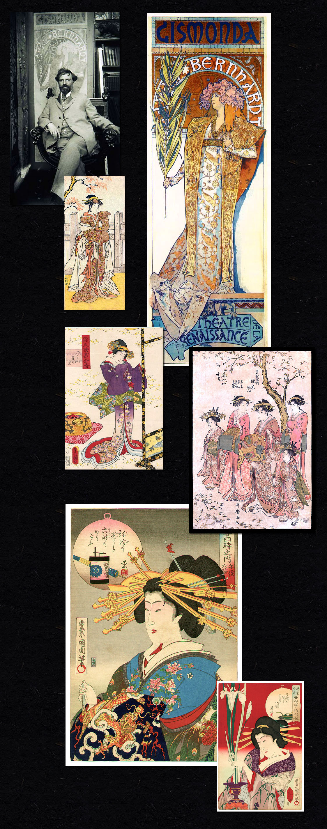
mucha was an unknown. yes, he was making his living by his art, an obscure illustrator, and this was his dream -- well, not the obscure part. one night when he was working late into the night, sarah bernhardt phoned the printer in a fit of pique! this new poster!!, she cried. it will not do! (of course she probably cried this in french)

although it may sound like a scene out of a busby berkeley movie, the only artist they could find that snowey night was this little man, awork at his station. and he vowed he would give it a try.

the rest, as they enjoy repeating, is l'histoire. she loved the poster so much that she signed mucha to be her exclusive poster-maker, and more, her costume and jewelry designer, stage sets, headdress and more. his work was so original! like nothing seen before--not even in mucha's own work!

and it suddenly became the design rage throughout paris: the scroll-like shape, the simplified grace of one woman, adorned, and set off by her glorious fabric. mucha was an overnight success, posters were seen for the first time as fine art, and the definition of art nouveau had now been solidified.

but... uh... wait.... you know what i'm going to say, don't you? gee, wonder where mucha found the inner vision to create something so "revolutionary"? come on now--give it a guess.

the solitary peaceful woman, the flowery hairpiece, the fabric and background as focus, the lack of perspective, even the shape of the dress, the clothing--what mucha did for a decade is to put a slavic/parisian spin on an ancient design scheme and claim it as his own.

and rarely if ever do i see anyone suggest otherwise, though to me it couldn't be more obvious.

(mucha's gismonda poster, his first of this style, is from 1894. the image just below the artist's photo is from about 50 years before that, i believe. forgot to get a credit for that one. below that, kunisada, 1858, in purple. notice her hair ornaments. in pink to the right are courtesans--with the elaborate wooden stick hair ornaments--and maiko, apprentice geisha, with the garland of flowers. sarah's headdress is much more a maiko hairdo than a geisha; yes it is inventive, but not invented. this one is by utamaro kitagawa and dates to the 1700s. and then two from kunichika toyohara from 1890. women of presence clearly did exist in print before mucha reawoke them in a new vernacular.)

please don't get me wrong--i adore mucha's work. i seem to never tire of it. i remember the thrill of seeing the original of one of his posters, a sketch, i guess, at the zimmerli at rutgers, that thin, human pencil line. so simple. it's just that, well, credit where credit's due, don't you think? what do you think?

Labels: , , , , ,

05 January 2007

Les Estampes Japonaises, la collection de Claude Monet

"One day in 1871, legend has it, a French artist named Claude Monet walked into a food shop in Amsterdam, where he had gone to escape the Prussian siege of Paris. There he spotted some Japanese prints being used as wrapping paper. He was so taken by the engravings that he bought one on the spot. The purchase changed his life — and the history of Western art."1

03 January 2007

the bleed of culture, the stain. the blossom

Hannah Borger Overbeck was one of the four Overbeck sisters who founded the Overbeck Pottery studio in Cambridge City, Indiana in 1911. She is credited as being the chief designer for several decades until her death in 1931, an influence that led to large decorated pieces with highly colored patterns, uncluttered, and incised lines based on nature.1

•

Otto Heintz was born into a family of manufacturing jewelers in Buffalo , NY . By about 1902 he had purchased a small company, renamed it the Art Crafts Shop, and began design and manufacture of copper items with colored enamel decoration. He was granted three patents. By 1906 he changed the name to Heintz Art Metal Shop, and shifted to bronze as the base material and sterling silver as ornamentation. The Art Crafts Shop hammered “look” was replaced by a series of machine-shaped bodies with sophisticated patinas. The definitive patent for applying sterling silver to bronze without solder was granted August 27, 1912 .

Heintz’ line consisted of vases and bowls, candlesticks, smoking accessories, trophies, lamps, desk accessories, picture frames, bookends and jewelry. From a circa 1916 trade catalog: “Heintz wares have won an enviable reputation among buyers of art goods, because of originality and beauty of design, and unusual quality of attractiveness. The articles are of bronze, and are decorated with sterling silver designs, permanently applied by our patented process. Beautiful colored finishes have been produced after much thought and experiment...”2

(ohara koson; hannah borger overbeck; heinz art metal; hiroshige)

Labels: , , ,

31 December 2006

fear not the night, dears


with no pattern but beauty!

for no reason
but
joy!


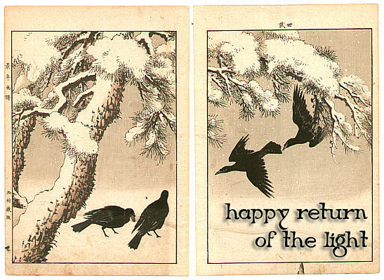
welcome the light!


(kogyo tsukioka; ethel kirkpatrick; ito sozan; biho hirose; seitei (shotei) watanabe; unknown; bairei kono; chikuseki; edna boies hopkins)

Labels: , , , , , , , ,

29 December 2006

robert doisneau

thanks to nathako at cosmopolitan stories. i always feel slightly tipsy when i try to read a french site, even with a translator. so i can't tell for sure if this is from a film, or from the period (the quality of the photograph, and her make-up, don't look like they're as old as the painting).

nevertheless, it's an interesting glimpse, this photo, into some of the effect this 'nouveau' movement might have been having on the not-so-nouveau people.

(Exposition de ses photos parisiennes à l'Hotel de ville, jusqu'au 17 février 2007 (salle St-Jean / rue Lobeau / tous les jours sauf dimanches et fêtes de 10h à 19h) : un grand plongeon dans le Paris des années 50-70, vu par Doisneau.)

28 December 2006

cacophany or harmony?

since we are so used to seeing it, i would like to remind you that pattern-printed, colorful clothing on women was not the stuff of illustration, nor of, well, clothing.

nor were highly stylized images of nature. here in the 1850s image we have some sketching in of nature, but with an eye towards 'natural,' sort-of.

but in rhead we have an unconscious, or subconscious, or just plain exuberant exploration of color and design unseen in western illustration until the influence of japanese art.

an interesting question might be, what is it in the japanese culture (pictured here by masanobu kitao) that the vibrant fabric was the norm? prints are so often awash with what to our eyes might be considered wildly competing motifs, with ornament and hue brought together in what to us may seem confection; what then, to the japanese?

Labels: , , ,

27 December 2006

rheading japonisme

in all the websites, books and articles i've read, i can't find anyone saying, those rhead brothers sure had a great collection of japanese prints, or, they sure went to japan a lot.

it was no longer necessary to be 'specifically' a collector, a specialist, or an expert about japanese art because japanese art had become part of the water in which we fish swim. the lessons learned had jumped

from theoretical to 'how things are.'

"Asian aesthetics, transmitted in part through Japonisme—the vogue for Japanese art, architecture, and decorative arts—reinforced a respect for the inherent properties of natural materials and encouraged the use of simplified forms, flattened perspectives, and asymmetry."1

the brothers' family, originally from england, was made up of potters, and incorporating japanese designs into their work was well-known internationally. both moved to the us where frederick rhead continued the family tradition and became a potter.

louis rhead was one of the three illustrators (with will bradley and edward penfield) to lead the procession when it came to japanese influences to the graphic arts in the us. in addition to being a poster maker, he was the editor of the japanese special issue of 'the art interchange,' a popular magazine devoted to arts and decor.


the rheads' british education had given them a broad introduction to the arts & crafts style (which, along with 'liberty style,' was england's 'art nouveau"), which translated well to the design aesthetics spreading across the world.

(koryusai isoda, louis rhead; frederick rhead--left, meiji period imari ware--right; louis rhead, eisen ikeda.)

Labels: , , , ,

24 December 2006

the coming of the cats

"Two common embodiments of the cat in Japanese mythology are at two extremes. There is the cat god of lightning, a frenzied creature called Raiju, who leaps frantically from tree to tree in a thunderstorm, scratching the trees with its razor-sharp claws and creating the sound of thunder.

Then, there is the cat god of good luck—Maneki Neko, who sits beneficently with its paw raised, and has become absolutely ubiquitous in countless shops and homes. In the complex history of this myth, the gesture of the raised paw may be based on images of cats washing their face—an action they sometimes perform in the company of strangers. At some point, a link was made between a cat washing its face and the presence of visitors; as time went on, it became causal—the sight of a cat washing its face could actually mean visitors were coming. From there came the next step: that a cat washing its face would invite visitors, much like an inviting hand." 1

i am readying the house
for her arrival on tuesday

(i believe the first one is by kuniyoshi, and the second is steinlen.
the third, i think her name may be ruby belle but i have to wait until she tells me.)

Labels: , ,

23 December 2006

birds in our transitions

edward penfield (collier's cover here; plus many harper's covers), will bradley and louis rhead were illustrators, designers and poster makers at the turn of the century. their work was exhibited with the japanese prints that were being imported to the us, and the style of each became strongly influenced by the prints. we see the same flat expanses of color interceded by rich pattern, and the asymmetrical layouts.

speaking of penfield (though they could have been speaking of any of the three), publisher's weekly said,
"
The advertising poster has within recent years actually soared into the regions of art." Penfield is also credited with bringing abstraction to commercial art through his boldly simplified shapes. This and other stylistic trademarks resulted from a distillation of a number of influences, including the compositional precepts and casual poses found in Japanese prints, the hand-craftsmanship of the Arts and Crafts movement, the impressionistic approach of Parisian poster-making, and British poise and directness. "*

bairei kono was a printmaker/painter who lived and worked in kyoto during the meiji period. he was also an influential teacher.

his two main bodies of work for which he is remembered are the seasonal documenting of birds and flowers, and another, called 'one hundred flowering plants,' published after his death.

just as penfield was being influenced by bairei's magpie, bairei as well was being influenced by western art, or so i hear. personally, i don't find a shadow in sight.

Labels: ,

20 December 2006

solstice


(Keinen Imao 1892)

Labels:

the shadowless land

okay, after going through all 1,007 images that one pulls up when doing a search for 'snow' on artelino, i am of the conclusion that.... there are no shadows in japan!!!

or maybe it's that part of the look of the japanese prints during most of the time we're talking about here that shadows were not displayed.

of course it was the posts on the 18th and 19th that got me started looking (and here i'm using different william rice (above right) and walter j phillips (above left) images which illustrate the same fondness we westerners seem to have with blue shadows).

the shadowless one on top is by takashi ito.

Labels: , ,

which came first...?

(seitei watanabe; francois & victor clerice; leonetto cappiello; maria likarz; theophile-alexandre steinlen; biho takahashi)

Labels: , , , , ,

19 December 2006

snow shadows

i am struck by the similarity between this walter j phillips image and the william rice image just below. well, same times, same motiva- tions. can't find a japanese print from which these could be a direct descen- dant, but there's time....

Labels:

18 December 2006

color

He was the author of three books - Block Prints: How to Make Them (1929), Block Printing in the School (1941), and Portfolio of Block Prints (1932). He taught in the public school systems of the Bay area, and he also taught at the many art societies, including the San Francisco Art Association, the California Society of Print Makers, and the Prairie print Makers.

Rice wrote about his philosophy of printmaking and said:

...the viewpoint of the artist differs from that of the commercial printer. In hand printing, each print has a beauty and individuality of its own. The aim is not to produce editions in large quantities, all alike and uniform, but to obtain slight variations which give a personal character to each print. The making of color prints of this type is essentially a painter's performance. There is a great fascination about color experimentation. The real pleasure comes from seeing the same subject appear in different colors, the design gaining in interest with each new color scheme. Wonderful color effects may be obtained by continual experiments. It would almost seem, sometimes, that no block has ever spoken its last word when it comes to its final color scheme.1

rice was clearly not the only one who felt that way, as these charming images by arthur wesley dow, and yoshida hiroshi illustrate.
blueinall

Labels: , ,

17 December 2006

between the earthquake and the war


arthur wesley dow created this work several decades before hasui kawase created his, but perhaps both were responding to the onrush of modernity, gatekeepers, both of them, of an imagined past.

or perhaps both just reporting on what they saw. like the impressionist painters, hasui didn't create his images in a studio, but rather on his constants travels in search of beautiful vistas. still preferring a kimono, he wandered the countryside, staying at inns and hunting for "live" views.

by the time he done this image of shichiri beach in soshu, kawase had already lost everything once: in a 1923 earthquake that killed 140,000 people, and that had destroyed everything in watanabe's publishing house (along with the work of many other shin hanga artists as well.)

everything was lost again in the bombing of tokyo in WWII. as they had once before, hasui kawase and watanabe shozaburo rebuilt again.
blue apple pie

Labels: ,

newer posts older posts