japonisme

26 February 2011

Turning Japanese II

This was the state of the art of printmaking in 1850,
the dark silence before the dawn of the Japanese
influence on everything:

Then the tsunami hit: and the stories
of the means of that onslaught are many.

Perhaps, since the woodblock prints were supposedly used
as wrapping paper on ceramic imports,
they were inadvertently discovered
by painters buying ashtrays.

(That's what they told me on the sightseeing tour to Giverney.)

There were the scholars, vendors, and pilgrims,
many of whom have been discussed here, whose
curiosity drove them to Japan itself as soon
as they could. They were inspired, profoundly awed,
and they looted the back rooms for whatever they could
for museums and private collections.

Extremely important, too were the Universal Expositions
which bloomed on every shore and brought
artist, craftsman, and person-on-the-street
into direct contact with the Japanese items themselves.

To explore the variety in more depth, check out this.

There were entrepreneurs on all shores (also previously
covered here), who opened shops, started magazines (or both),
to display and sell the imports; or in Japan where they began
to marshall artists to produce what the West wanted.

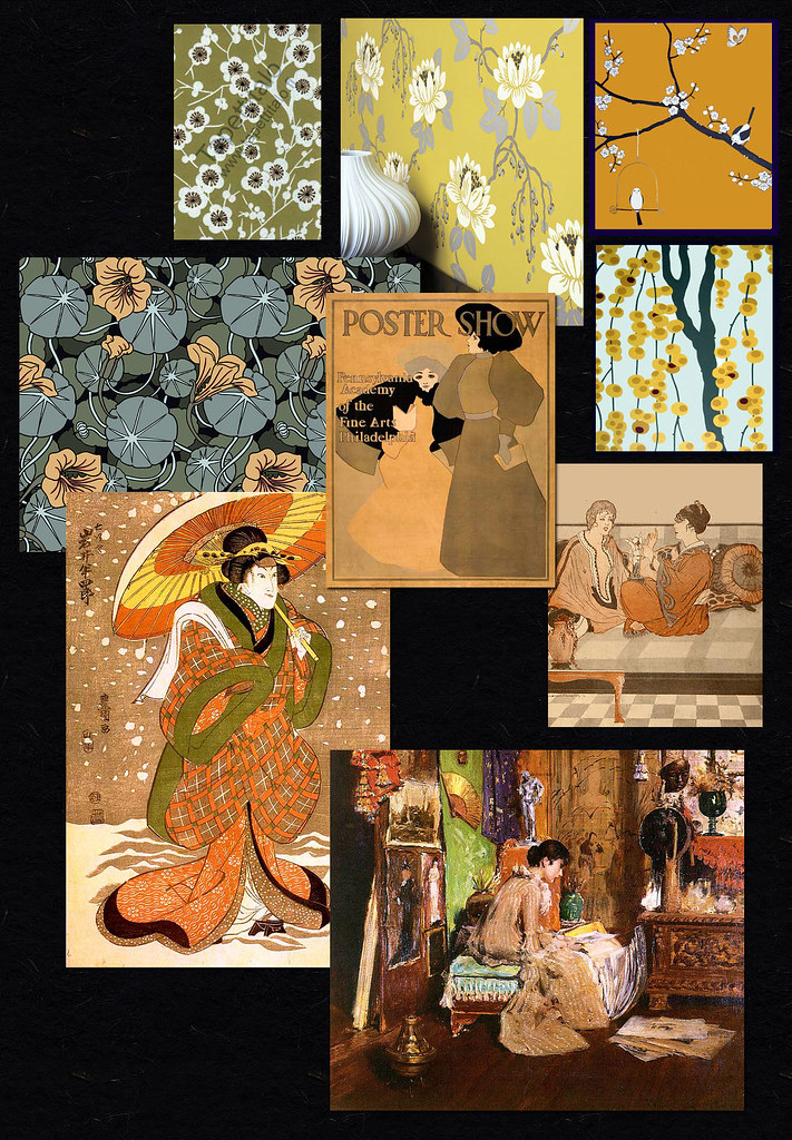
Now, I'm not saying that each artist pictured here was
introduced to Japanese arts and crafts in one of these ways.
What I am saying is that every single one (and all the more
who are not featured here) was influenced none the less.

No longer was the body's content as important as were its bones.
And all of the other Japonisme-y things: flat planes of color,
asymmetry, outlines. Consciously or unconsciously,
people had begun to see differently.

The language changed, and changes still.

Labels: , , , , , , , , , , , ,

04 April 2010

light, reborn • (the calendars)


Maxfield Parrish:
the real painter of light

find it for yourself!

Labels: ,

13 May 2008

birth of the blues

how does a color palette sweep the world? why, in the early fifties, did multiple china companies put out sets in grey, chartreuse, maroon, and forest green? and why, after the first world war, was there such a wondrous explosion of, with its complementary colors, cobalt blue?

cobalt blue. it's a color so intense you can hear it. (to me it sounds like a mixture of this and this.)

"Over the last two millennia, there have been blues available to the artist that offer rich hue, good tinting strength and covering power. But they’ve come at a high price, both in terms of cost and in effort to produce.

From 'smalt,' the first-ever compound of cobalt, used by the Egyptians in a ground glass form, to 'Lapis lazuli,' the natural form of ultramarine dug from mines in present-day Afghanistan. Blues were considered a symbol of high status, not only for the painter that could afford to use them, but for the patron that could afford to own a painting that included the colour.

Beginning in 1704, with the synthesis of Prussian Blue, and then in 1806, with the development of Cobalt Blue, and finally, in 1826, with the introduction of a laboratory-produced ultramarine that was identical to the natural lapis, blues became more affordable." 1

some writers on the subject say it was being in the aftermath of WWI itself which dictated that bold colors were needed. the doldrums needed to be over. others suggest it was the influence of the arts from other parts of the world that had begun to have this influence: prints from japan, bakst costume designs for the ballet russe.

"Maxfield Parrish studied the techniques of the Old Masters and then, using pure bold colors, particularly lapis lazuli (cobalt blue is frequently called 'Parrish Blue'), achieved an unsurpassed radiant quality in his work. His idealized women adorned in classical gowns with backgrounds of electric violets, radiant reds and rich earthy pigments, created an idyllic world indeed." (Magazine Antiques, Nov, 1995)

europeans (poiret, the amazingly prolific silver studio, to be covered more fully soon) and americans (gustave baumann, maynard dixon) alike embraced the color scheme as it reached it's most popular moment following the depression. as the popularity of 'art deco' increased, manufacturers in all industries rushed to keep up.

"Designed by Fredrick Rhead for Homer Laughlin, Fiestaware was introduced in first half of 1936. The simplicity and elegance of Fiesta's design, a set of concentric rings near the edge, and bright colors made Fiestaware popular in the 1930's. This response may have been a result of the difficult and bleak times following the beginning of the Great Depression." 2 we have met fredrick rhead before; he is louis rhead's brother!

"Homer Laughlin’s styles shrewdly changed with the fashions of the time, gradually becoming less formal and more clean and stylized. That trend reached its apex in 1936, thanks to the art director Frederick Rhead. After experimenting with various shapes and glazes, Rhead combined the streamlined style of Art Deco with the look of handmade pottery and glazed his new designs with solid, vibrant colors.

(Advertisements claimed that the hues were inspired by “the colorful festivals of Mexico.”) Most of all, the new dishware seemed relaxed and fun. “The layman,” Rhead said, 'likes to mix his colors.'" 3 (note on the posters; they all mention not carnivals but fiestas!)

we have seen this blue before, it's prevalence in promotions for paradise -- california, and in celebrations of and invitations to beauty around the world. and we will see it again (i've been collecting). in the meantime, if you have any thoughts on this, or come across any sites which add light, please let me know. thanks.

and please forgive my recent 'hiatus.' i lost my spacebar!

Labels: , , , , , , , , , ,

22 December 2007

THE SOLSTICE IS COME

JUST NOW

In the morning as the storm begins to blow away
the clear sky appears for a moment and it seems to me
that there has been something simpler than I could ever believe
simpler than I could have begun to find words for
not patient not even waiting no more hidden
than the air itself that became part of me for a while
with every breath and remained with me unnoticed
something that was here unnamed unknown in the days
and the nights not separate from them
not separate from them as they came and were gone
it must have been here neither early nor late then
by what name can I address it now holding out my thanks

W. S. Merwin

from The Pupil © 1988

Labels: , , , , , , , ,

18 July 2007

lichts camera pattern


(via) (via)

the prints are old and the wallpapers are new, then, as now, the designs, the colors wake us, warm us, cheer us and make us glad.

(artwork clockwise: maxfield parrish, marcel poncin, william merritt chase, and utamaro. wallpapers left to right tradeworth, ritva kronlund, romo, and two from fromental. please recognize that the colors here may be just plain darn wrong.)

Labels: , , ,

04 February 2007

golden globes


(maxfield parrish; toshi yoshida; jowett; woodbury; tiffany)


Labels: , , , ,

older posts